
High Concentration
#110: What the top-heavy market means for today and tomorrow.

This week, a troubling chart made the rounds in the financial chat-o-sphere, showing an extreme degree of concentration in the U.S. stock market. The top five largest companies make up a full 24% of the market capitalization of the S&P 500 — a top-heavy market surpassing even the 2000 internet bubble.
At a glance this chart might give you the willies, but upon closer inspection, one should notice a critical detail…

This chart is four years old. As indicated by the NBER Recession shading, we can pinpoint this snapchat as April 2020, the bottom of the COVID crash.
This is a good reminder to read charts before jumping to conclusions. But more importantly, adding this temporal context flips some of our natural inclinations upside down. Often we think of a highly concentrated market as being inherently risky. If only a handful of stocks dominate the market, what happens if they falter? And what lofty assumptions propel these companies head and shoulders above the rest of the market in the first place?
Yet with perfect hindsight, April 2020 was a fantastic time to buy nearly any stock in any market, worldwide. At least in this circumstance, the surge in concentration was a result of an outsized decline in the bottom 495, rather than a bubble forming at the top.
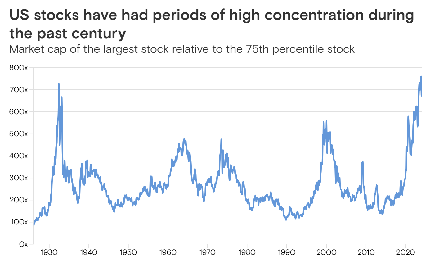
This dynamic is actually quite common. Often, periods of high concentration occur during periods of market disruption. Using data from Goldman Sachs dating back a century, we see that the most extreme market concentration (ignoring recent history) occurred all the way back in 1932. At the peak of the roaring twenties, the market was actually quite evenly distributed by historical standards. It wasn’t until the S&P 500 crashed 85% in the depths of the Great Depression that concentration surged. Again, this was a great time to buy stocks.
We can see this “flight to safety” clearly in recent data. For example, if we compare the equal weighted S&P 500 to the market-cap weighted S&P 500 since 2000, two sudden spikes occurred during the great financial crisis of 2008 and the COVID crash of 2020. The same dynamics were on display in the crash of 1987.

My point is not that concentration is a good thing — rather that it isn’t necessarily a bad thing. Further context is required.
It seems that we can split this historical precedents into two categories:
Bear Bottoms: These are easy to diagnose. Has the spike in concentration occurred during a market crash? Have market-wide multiples compressed? If so, it is likely a Bear Bottom. Buy the market (and laggards) and head to the beach.
ex. 1932, 1973, 2008
Bull Tops: On the other hand, if concentration builds steadily alongside a rising bull market and expanding multiples, it suggests valuation creep and overinflated expectations that may lead to broad underperformance going forward.
ex. 1964, 2000,
If we overlay the S&P 500 against Goldman’s concentration index, we can see that these two categories of concentration have marked critical turning points in the market. While major Bear Bottoms have marked the start of extended bull runs, major Bull Tops have generally preceded periods of poor market-wide performance.
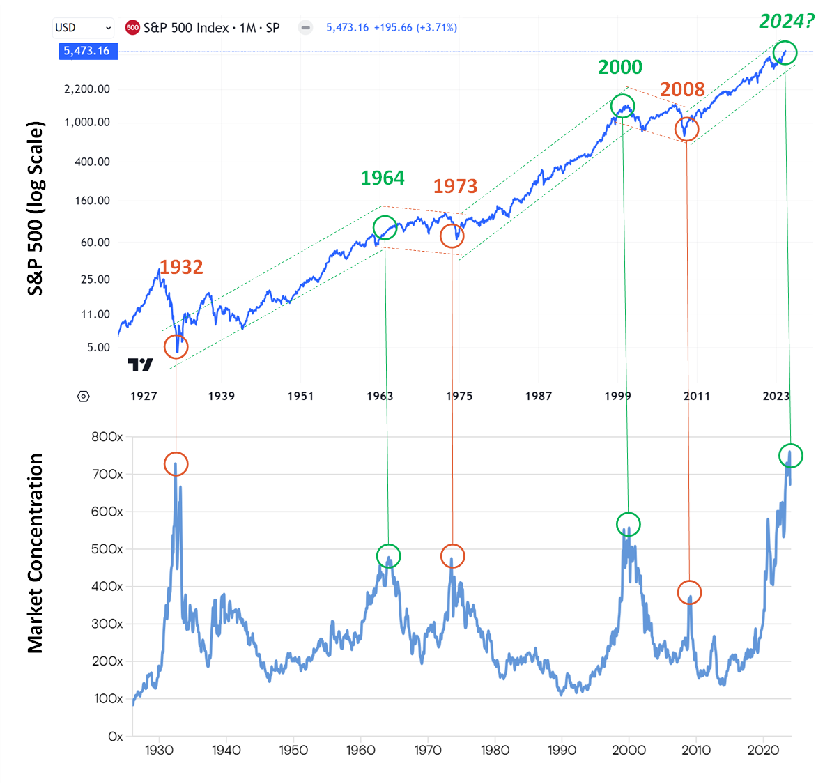
If we rely on this template to assess the current market, the conclusions are unsavory.
After a brief reprieve following the COVID crash, market concentration has now surged even higher. The top five companies’ combined market cap of $15.0 trillion (MSFT, NVDA, AAPL, GOOG, AMZN) now represents 29% of the S&P 5001, up from 24% in April 2020. This increased concentration has not come amid a market crash but rather a frantic rally, driven in large part by multiple expansion of market leaders. Momentum has been the defining factor of the year, and it is increasingly hard to justify price action in certain names as “healthy”.
In other words, if history is a guide, it looks a whole lot more like a Bull Top than a Bear Bottom.
So what comes next?