The Volatility Squeeze: Part 2
The Volatility Cycle and implications for the market.
In The Volatility Squeeze, we discussed the Volatility Complex, the potential for a short squeeze in volatility, and the corresponding risk to equity markets. This follow-up focuses on the distribution of returns in volatility trades, how the Volatility Cycle determines major market movements, and what that means for volatility and equities in the near term. This is not investment advice. This is the opinion of one non-expert on the internet. I own certain products discussed here.
Volatility and Insurance
To help conceptualize the returns on volatility, think of buying volatility as buying insurance, and selling volatility as selling insurance. The buyer of insurance pays a small amount of money on a consistent basis to the insurer, and on occasion receives a large payout back. The insurer has the opposite cash flows – it receives a small amount of money on a consistent basis, and occasionally pays a large sum.
In other words, buying insurance has a negative median return, with a large tail of upside, while selling insurance has a positive median return with a large tail of downside.
The distribution of returns for insurance buyers and sellers looks something like this.
So why do people buy insurance knowing that in most periods you will pay a premium and get nothing back? As an individual, a large unexpected medical bill could ruin your financial wellbeing, so you are willing to pay a premium to mitigate that risk, even if you have no expectation that such an event is likely to happen. It is a risk mitigation tool.
The insurance seller also benefits. The insurer has historical data and can model how likely it is for a claim to occur, allowing them to price the policy to make money over the long term. The insurer also benefits from pooling risk. A car insurer does not know whether a single policy holder will get into an accident in the next year, but it can predict the total amount of car accidents over its pool of thousands of policies. By pooling idiosyncratic risk, the insurer can smooth its cash flows such that its large payouts on a few policies are offset by the smaller premiums it receives on the whole pool.
Insurance is a mutually beneficial value exchange where individuals can protect their financial wellbeing and insurance companies are consistently profitable with regular cash flows. Risk is distributed, creating a more stable system.
Now, let’s turn to volatility.
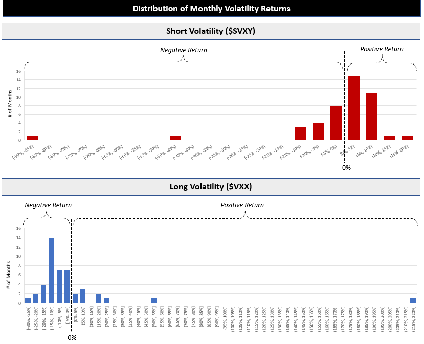
While the Volatility Complex is far larger and more complex than any single product, consider a long volatility product, $VXX, and a short volatility product, $SVXY. Below is the distribution of monthly returns of $VXX and $SVXY since 2018.
The two distributions are combined in one graph below.
The distributions match the insurance analogy. Long volatility products lose money in most months, but have huge upside if the insurance policy pays out. Short volatility has the mirror profile – it makes money in most months but has the risk of dramatic drawdowns if there is a claim.
When combined with the Devil’s Correlation – volatility and price are negatively correlated – the use of volatility products as portfolio insurance makes sense. Since volatility spikes coincide with market declines, you can hedge a long equity portfolio with long volatility exposure. While you expect the long volatility investment to decay in most months, the upside tail will offset a drop in your overall portfolio in a market selloff. You pay a premium for the insurance.
One could also play the role of insurer by evaluating the likelihood of a claim and choosing to price their policy to make money over the long term.
While this analogy is useful, there are several key distinctions between insurance and volatility that result in very different risk profiles in aggregate.
Insurance pools uncorrelated risk, resulting in a consistent balance of premiums and payouts across the pool. But volatility insures against a singular, market-wide risk. When the market does not fall, all volatility buyers will lose money at the same time. If the market does fall, all volatility sellers will have to pay out at the same time. There is no smoothing of cash flows, as all the policies are insuring the same underlying event.
Insurance is tied to an underlying asset – you can’t take out fire insurance on your neighbor’s house because you know their electric wiring is shoddy. This limits the total insurance payout pool to the aggregate asset value of the underlying. By contrast – with volatility there is no direct tie to the underlying. You can buy as much long volatility exposure as you can afford – you can buy five fire insurance policies on your neighbor’s house.
Volatility, unlike insurance, is actively traded, which means that buyers and sellers can switch sides at any point in time based on their view of the market or a change in the price of the insurance. Volatility sellers can simply sell their exposure at any time to capture profit or limit losses - increasing the price of volatility in the process.
These key differences, combined with the reflexive actions of other market participants which amplify movements in volatility, result in substantially higher aggregate risk in the market. Risk is concentrated rather than distributed.
With volatility, if you see your neighbor’s house starting to smoke, you can buy an insurance policy or five. The payout will be the difference between the price of insurance for a smoking house and a house engulfed in flames.
So how do you spot a smoking house?
The Volatility Cycle
Moves in volatility and market prices are not random. Rather, in recent years they have followed a predictable pattern – the “Volatility Cycle”. The causes of the Volatility Cycle are discussed at greater length in the prior post.
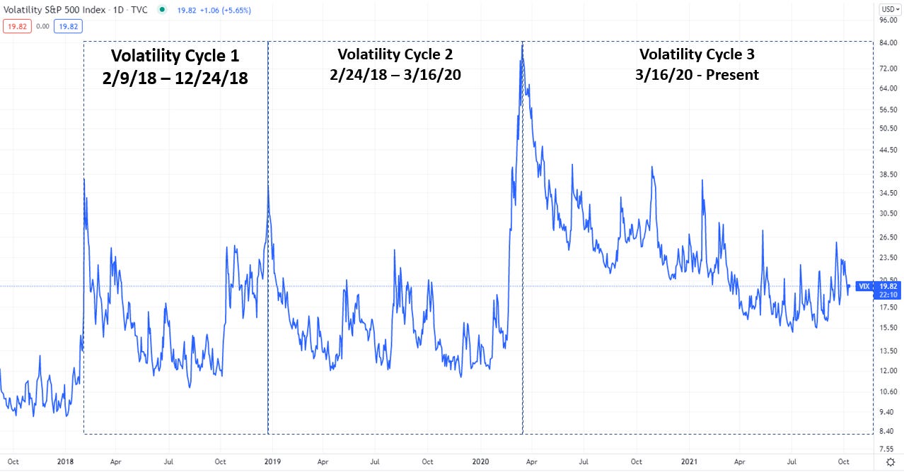
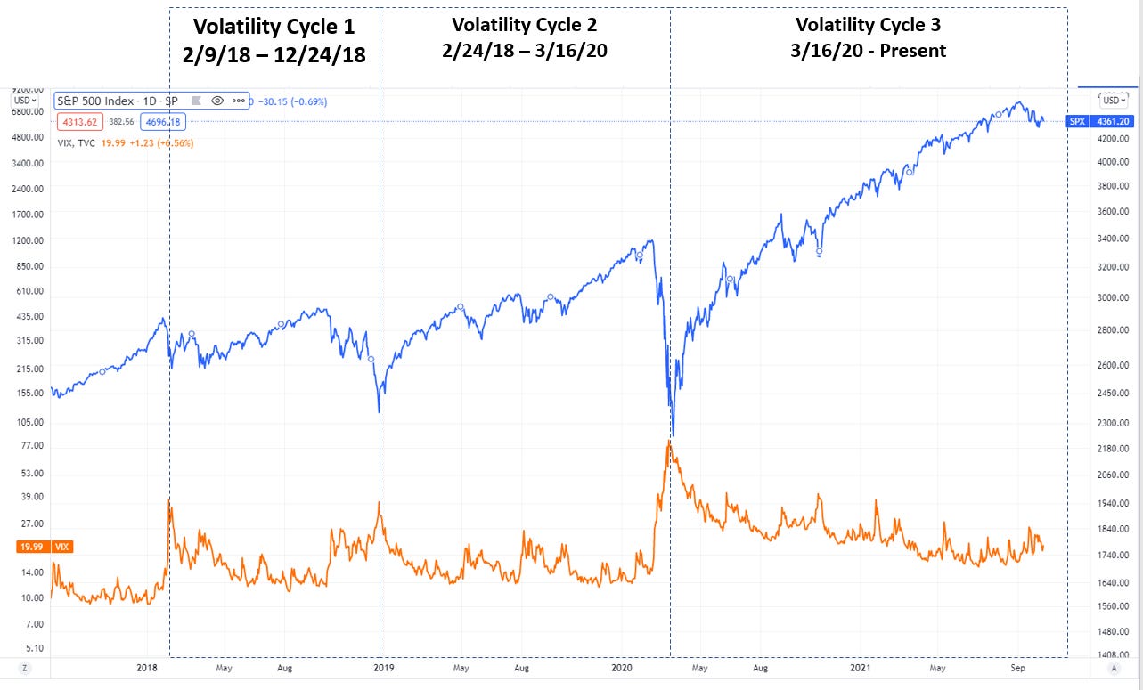
Since Volmageddon, the market has experienced two complete Volatility Cycles. The peaks and troughs of these cycles coincide with the local highs and lows in the stock market. Today, we find ourselves in the waning days of the Third Volatility Cycle.
Below are the Volatility Cycles, charted against the VIX volatility index.
Adding the S&P 500 to the graph shows how the cycles correspond with equity market movements.
Building off the arguments of The Volatility Squeeze, it is likely that these market moves are not a result of “market news” but rather spurred by rebalances in the Volatility Complex and subsequently reinforced by market narratives.
Now, let’s look at these cycles through the lens volatility as expressed by the $VXX (long VIX) and $SVXY (short VIX) volatility products.
Each cycle begins at peak volatility. Market prices have fallen, the price of volatility is incredibly high, and everyone who was previously short volatility has already been squeezed out. At this point, volatility begins to decline, and the equity market stabilizes and begins to rise. Realized volatility and implied volatility continue to fall as prices increase.
The gradual decline in volatility lifts the market, resulting in a self-reinforcing but decelerating cycle of higher prices and lower volatility. The lower-volatility stage makes up the vast majority of the cycle, during which short volatility products will continue to see gains while long volatility decays. During this period, returns on short volatility products like $SVXY increase, and the value of long volatility products like $VXX decrease.
Late in the cycle, the tables turn. Volatility hits a floor which it can’t break. Slowly it starts to increase, and prices begin to decline. At this point, the accelerating, higher-volatility stage begins – traders buy puts or sell shares and short volatility traders close their positions, sometimes by force. This stage of the cycle is what I’ve called the Volatility Squeeze.
This process ends when the short volatility products lose their cumulative gains since the prior peak, and long volatility makes back all of its losses. When the cycle ends, the cumulative returns of long and short volatility since the beginning of the cycle are near zero.
While not perfect, this demonstrates the zero sum qualities of volatility trading.
The Third Volatility Cycle
The First Volatility Cycle began on 2/9/18 and ended on 12/24/18. At the peak of the declining-volatility stage in early October, the S&P gained 12%, short volatility ($SVXY) gained 37% and long volatility ($VXX) lost 47% since the start of the cycle.
In October, the trade began to reverse. Over the next two months, $VXX outperformed substantially, eventually regaining its total losses while $SVXY gave back its cumulative gains.
Given the performance of $VXX and $SVXY through the first stage and the expectation of a convergence in returns over the full cycle, we can estimate that the $SVXY should lose ~27% over the second stage (1/(1 + 0.37) – 1), while $VXX would nearly double over the same period (1/(1 - 0.47) - 1 = 89%). This indeed occurred as shown below.
Long volatility ($VXX) as shown in blue posted a 94% return over the period of October to December.
Short volatility ($SVXY) shown in red lost 32% of its value over the same period.
A volatility seller or volatility buyer from the beginning of the cycle would break even, but a late entry into $SVXY would experience a significant drawdown relative to their investment, while a late entry to $VXX would have a large gain.
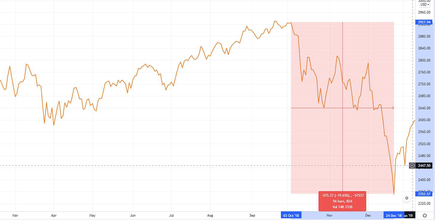
Equity returns in the late stage of the cycle were not pretty. The S&P 500 shown below in yellow, fell 20% in two months, reaching a low of 2350 on 12/24/18. Overall the market fell 7% from the beginning to the end of the cycle.
The Second Volatility Cycle began on 12/27/18 and ended on 3/16/20. By the peak of the first stage, the S&P 500 gained 44%, $SVXY gained 70%, and $VXX lost 73%.
The reversal in volatility began in January 2020, a month prior to the S&P 500 peak in mid-February 2020. Using the same logic as above, we could estimate that the $SVXY should lose ~41% in the second stage (1/(1+.70) – 1), while $VXX should see a 270% gain over the same period (1/(1-0.27) - 1 = 270%).
$VXX, in blue below, gained 330% from February 18th to March 16th, overshooting our mathematic expectations, and continued to gain through March 18th, ultimately reaching achieving 400% gain in one month.
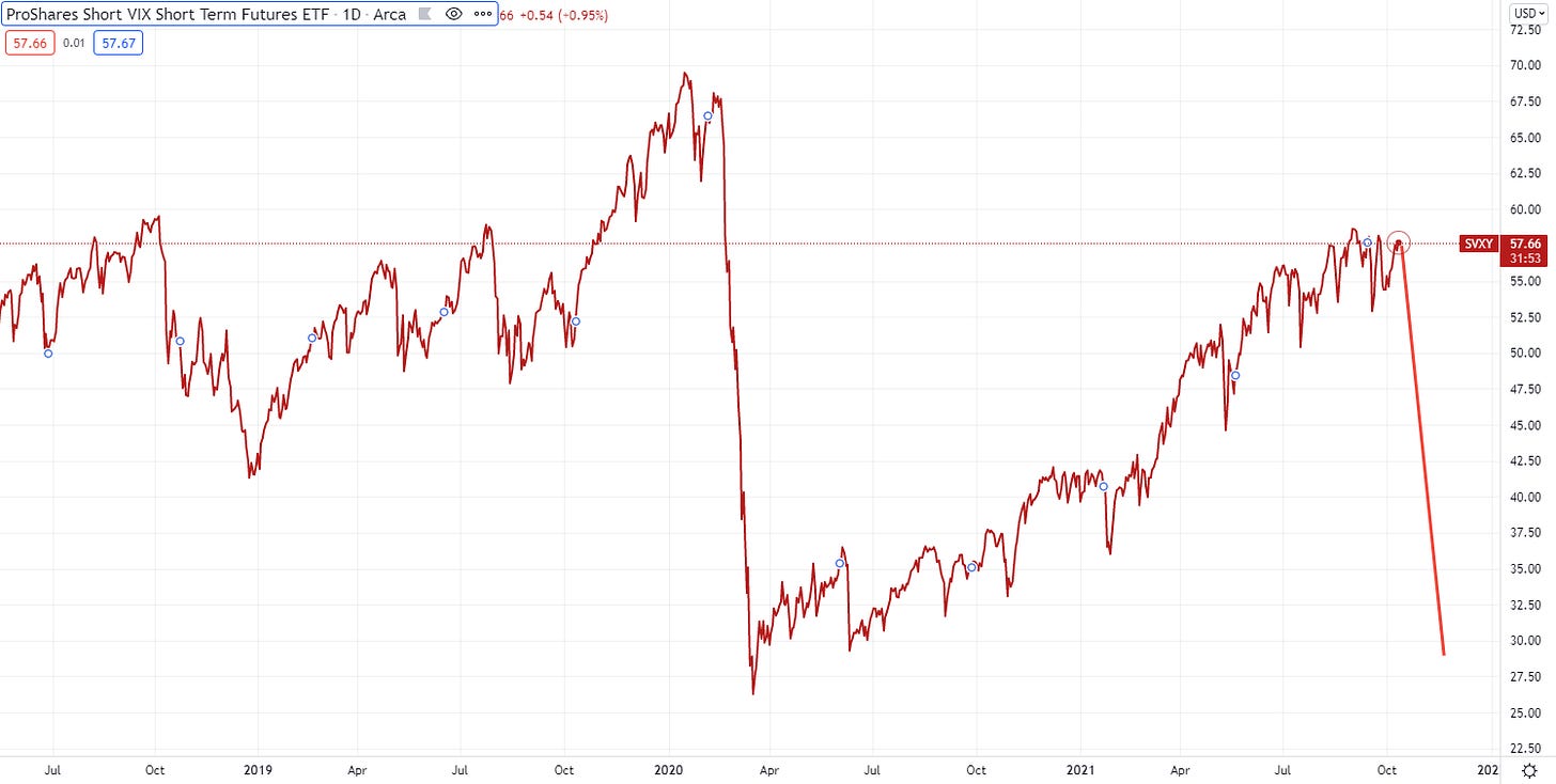
Meanwhile, $SVXY, in red below, lost 61% from its peak in January through March.
In this Second Volatility Cycle, the performance of long and short volatility actually overshot expectations. The most likely explanation is that the reflexive nature of other market participants added momentum beyond the volatility unwind (i.e., panic over the crashing market and COVID) causing the market to shoot beyond its natural equilibrium, if only for a couple days.
The equity returns over this period should not come as a surprise. The S&P 500 had lost 30% when volatility peaked, which ultimately reached 34% by March 23rd as the momentum of sellers continued. At this point, the market had lost 12% since the beginning of the First Volatility Cycle, over two years prior.
The Third Volatility Cycle began on 3/16/20 and continues today. From the 3/16/20 to 9/2/2021, the S&P 500 gained 89%, $SVXY gained 107%, and $VXX lost 89%. The drawdown in long volatility is more extreme than it was at the peak of the prior cycles, and market prices are more elevated. This is a smoking house.
Using the same logic, we can estimate $SVXY will lose 52% of its value (1/ (1+1.07) – 1) by the end of the cycle. Similarly, given its significant drawdown to date, $VXX should stand to gain 809% (1/(1-0.89) -1). Yes – this math suggests that the $VXX could be an eight-bagger when the second stage accelerates.
While these numbers may seem extreme, it does not look unnatural when graphed, with the other cycles included as reference.
First, $VXX, in blue, with the 809% increase added.
Similarly, a 51% drawdown in $SVXY as drawn below appears realistic.
As for the S&P 500, it’s harder to estimate – but history shows that the Volatility Cycle has tended to pull equity markets at least down to their starting value. A fall to 2400 would imply a 45% drawdown from current market levels. As was seen in the March 2020 crash, it’s possible for the drawdown to overrun this target as panic would likely ensue.
Before proceeding, I recognize fully that drawing a vertical line down on a market chart is the epitome of bear porn, to the point where it is usually now done in jest to troll bears. I recognize that predicting a >40% drawdown in market prices seems absurd. But I’m not concerned with that, I’m merely writing what I believe to be true. How many people in February 2020 thought the market would drop 34% in the next month?
Looking at a longer timeline, this drawdown does not seem ridiculous based on the extraordinary elevated prices that we see today. By most valuation metrics, the market today is trading at levels only rivaled by the extreme peaks of the dot-com bubble or 1929. When combined with the ever-worsening macro environment, including pressure on corporate margins and growth, a reversion of this magnitude is not unrealistic.
The modern volatility era has shown itself to be much less stable and more prone to rapid price moves. It’s certainly possible that the drawdown takes longer to complete or has waves of ups and downs, but my guess is that a rapid decline is more likely.
Leverage
The current drawdown in long volatility suggests that $VXX could see an 8x return during the Volatility Squeeze of the present cycle. This would be a good hedge to a long stock portfolio or an great gain for a speculative investor. But today’s market participants are preconditioned not to buy an underlying asset, but rather to take directly levered positions or indirectly levered positions through derivates. Volatility is no exception.
Those looking to add leverage would buy $UVXY instead – a double levered long volatility ETF, where every dollar you spend gives you twice the long volatility exposure. This leverage magnifies decay during the first stage of the cycle but also magnifies gains during the second stage. $UVXY gained 163% and 1163% in the First and Second cycles, respectively.
For even more extreme exposure, an investor may simply use the same tools that they used to make the market soar over the past 18 months – options. As of today, Nov-19-2021 $UVXY CALLS at a $50 strike price cost ~$1.00. As a rule of thumb, if $VXX is expected to rise 8x, then $UVXY stands to gain 16x. From its current price of $20.69, a 16x gain would imply a peak price of $331. If this were to perfectly coincide with the November 19th expiration, these options would make $280 dollars for every $1 invested. This is a 28,000% gain. Here’s the math ($331 - $50 - $1) / $1 = 280x.
While seemingly too extreme to be true, graphing that gain looks potentially conservative compared to the Second Cycle. If prices and volatility overshoot as it did then, the true gain could be even higher (if timed to perfection).
Indeed this level of exposure highlights how fragile the current market is. Just as it is possible to pull stocks up by buying high out of the money calls, forcing dealers to purchase the underlying (known as a “gamma squeeze”), the same logic applies for volatility. With derivatives on levered products, the amount of exposure one can buy with small sums of money is enormous.
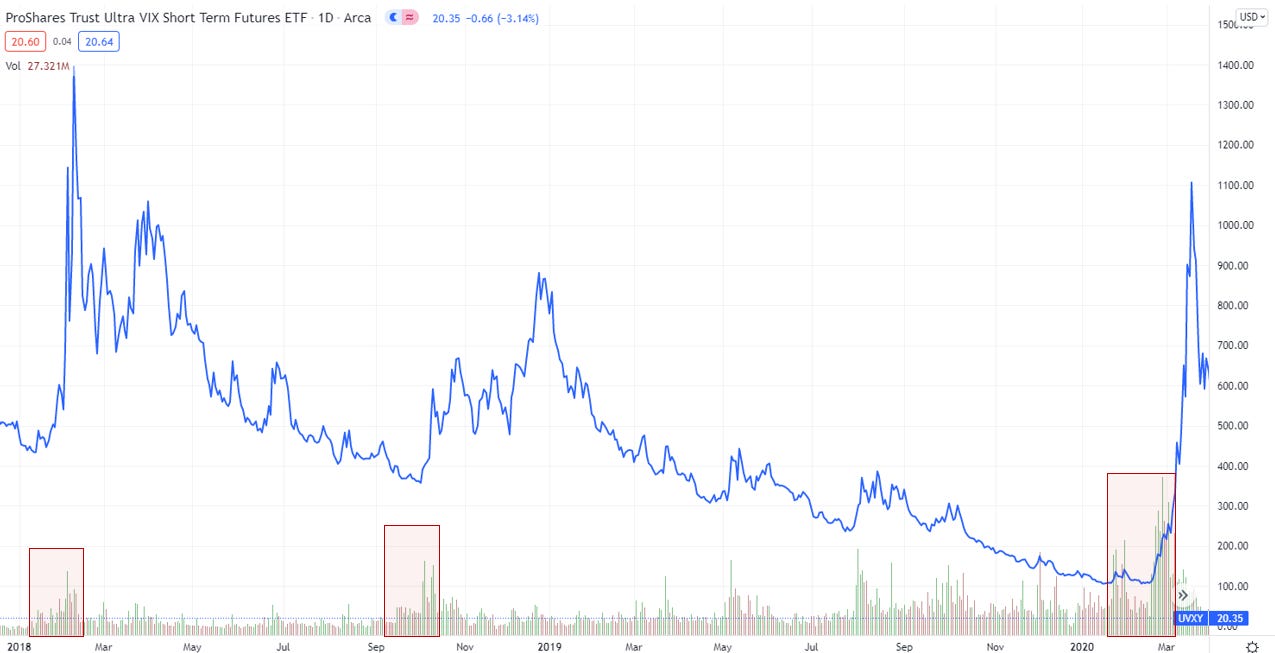
Further, it is likely that increasing interest in levered long volatility products such as $UVXY are key accelerating factors for the Volatility. There was a notable pickup in $UVXY volumes in this ETF immediately preceding each of the historical volatility unwinds, suggesting it is a leading driver, not a passive responder.
Looking at volumes through today shows an enormous increase over the past several months.
Conclusions
The Volatility Cycle is the best explanation for the extreme market fluctuations over the past several years and provides a method for charting the future. The current cycle appears to be in its late stages, making long volatility a potentially high returning prospect. The extreme drawdown in long volatility products so far this cycle could lead to a market correction more extreme than previously experienced. This analysis is one non-expert’s opinion and is not investment advice.
The purpose of highlighting levered products and derivates is merely to highlight how the Volatility Complex allows for exposures to be magnified up the derivative chain, and is not an investment recommendation. The timing of such a squeeze remains uncertain and it’s possible that history does not repeat itself in the ways assumed here. That being said, this information is highly relevant for any investor to consider.
To repeat the conclusions of The Volatility Squeeze - either be on the sidelines or on the right side of the squeeze.










Two important corrections - $UVXY is now a 1.5x levered ETF. Previously it was 2.0x. Also the volume lines in the final chart are not adjusted for splits so are not apples to apples with the longer term historical data, but the point is the monthly increase in the past two months (which is similar to uptick seen before prior unwinds). Thanks to the readers who pointed these out.
This is incredible. So much gratitude to you. I already bought some nov 19 UVXY calls $55. As one chart loving MD to another, thank you. You have inspired me in so many ways. I have also been backing up the UVXY truck for weeks now. I've tried to warn friends and family, and the responses are silence. But I know I'm not crazy.